
Typography as Data Visualisation
Depicting data using nothing but fonts

Hello friend! Welcome to Graph Paper, a publication about turning numbers into pictures. Each month: an article covering an unusual story or interesting perspective on data visualisation.
“Pie charts are the Comic Sans of data visualisation” says Randal Olson. An excellent observation — but not because they’re both inherently flawed.
As the low-hanging fruit of the Microsoft Office suite, they are frequently used in a range of inappropriate contexts. The friendly font and the part-to-whole chart share a bad reputation because people object to their misapplication. It’s often not the formats themselves that are being criticised.
This article isn't about drawing comparisons between fonts and charts, rather the interesting things that can happen when the two meet. It's about exploiting typographic technology to display numerical data, and the weird and wonderful fonts that make this possible.
What does a chart made from text look like? An obvious example is a word cloud, which uses font size to encode frequency. But there are many more physical attributes of text beyond font size that could be used to represent data: font weight, font width, italics...
Typically, these variations within a font family are offered as discrete options. Regular or bold. Italics or not.
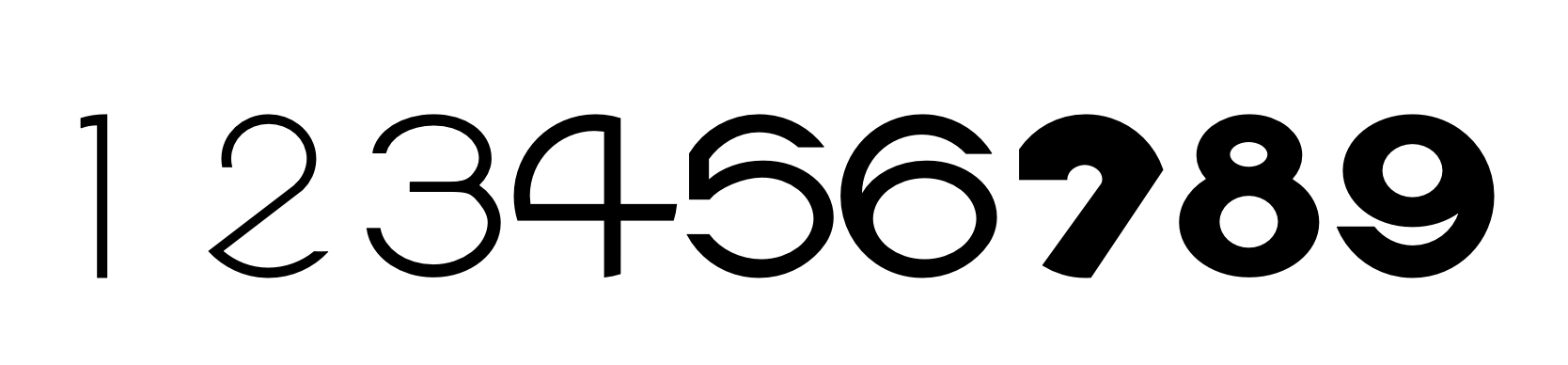
This changed with the introduction of variable fonts in 2016. These fonts provide the ability to fine-tune the appearance of text, to choose the desired thickness, slant, etc.
Variable font technology is to fonts what the dimmer switch is to the lightbulb. Mood-lighting for typography.
It typically works through interpolation. Font designers define a limited number of styles and the technology fills in the gaps, offering every possibility in between. The letterforms change as a result of passing numerical values to an axis. Sound familiar?
In the Climate Crisis font, the appearance of the letters corresponds to the amount of sea ice in the Arctic from 1979 onwards, with predictions to 2050. Here's an animation I made showing it in action (will take a while to load):

That was produced using coldtype, an open source font animation package for Python. Here's how variable fonts might be applied to other chart types:

You might call these typograms. The text represents a data point and a label. Karim Douieb does something similar using letter heights to represent trends in baby names.
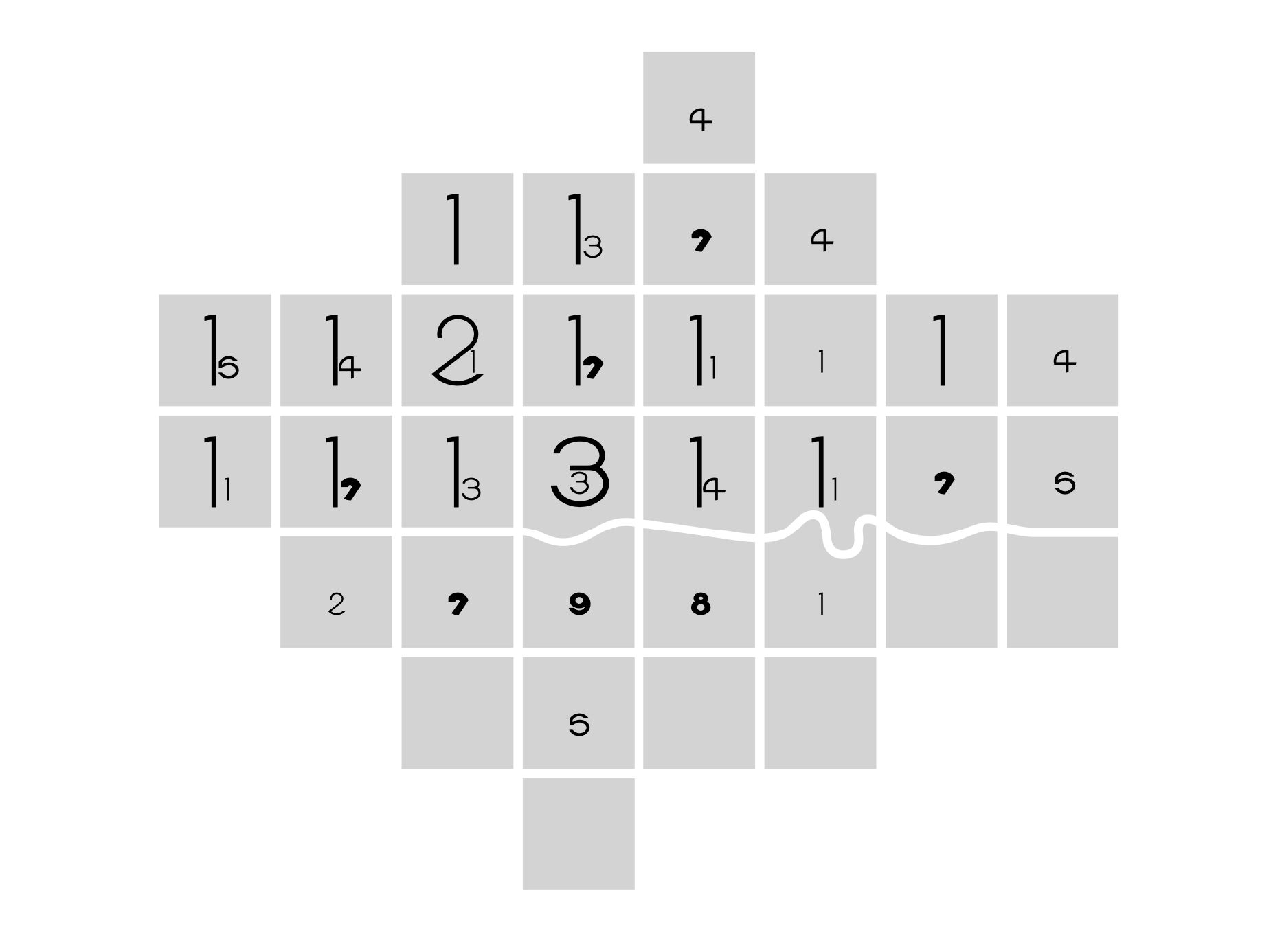
An even more unusual application is FatFonts, where the thickness of the characters 0-9 is proportional to their numerical value.
Multi-digit numbers are even stranger. The digits which are an order of magnitude smaller are given a smaller size.
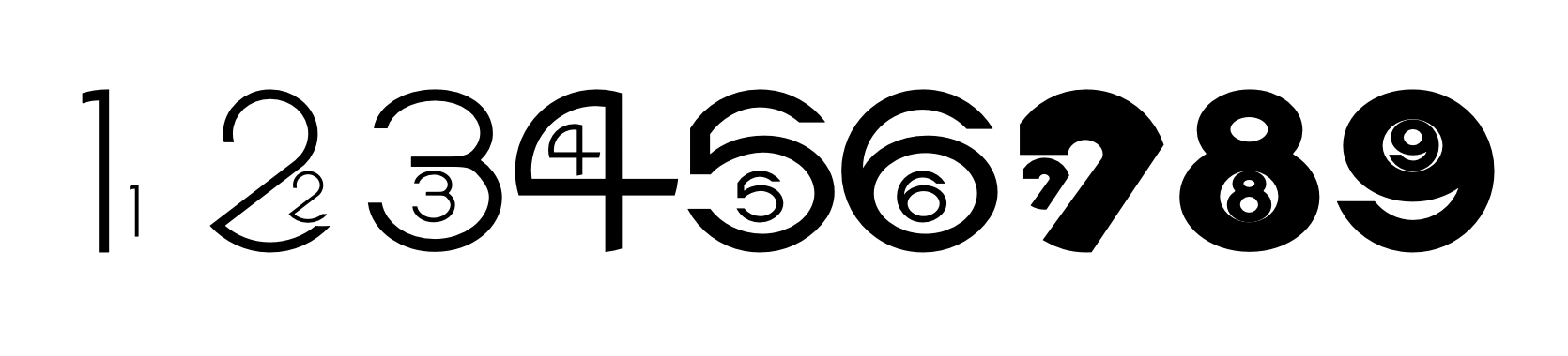
A graphic using FatFonts can be read on two levels. Larger digits use more pixels, so viewers can get a sense of magnitude through density alone. On closer inspection, the raw numbers are available. The result is a (semi-)legible heatmap. Here's the number of London Underground stations in each London borough; with the far fewer south of the river:
There's a recent trend for including graphics within lines of text, which has been dubbed ‘Nouveau Rebus’. It's a development of a design format that's centuries old, so naturally it's been put to use for data visualisation purposes. Sparklines allow readers to see a pattern of data without breaking away from the text that references it.
Originally, creating sparklines required specialist software. Now, it’s possible to produce them using a font, thanks to a clever typographic trick.
A ligature is a combination of two (or more) characters into one. Ligatures have been used for centuries and are the basis of several characters in use today. The ampersand (&) is a ligature from Latin et (‘and’). The Bluetooth symbol is formed from the runes for King Harald Bluetooth’s initials.
Modern fonts can dynamically convert character combinations into ligatures. For example, three consecutive stops ‘.’ becomes a single ellipsis character ‘…’
However, the ligature doesn’t even need to resemble the original characters. It’s possible, with a font like Sparks, to type numbers and get an appropriately scaled bar chart in return.

Another font, Chartwell, expands the possibilities even further, offering a huge range of options: histograms, radar charts, scatter plots, pie charts, progress bars, stacked area charts, and rose diagrams.


It’s a lightweight approach to data graphics that makes it possible to build a chart without even leaving your word processor.
Traditional data visualisation tools are usually suitable for building intelligible graphics. I’m not suggesting every company should be using variable fonts for their quarterly sales charts. But, sometimes, a novel format can grab attention.
Looking beyond conventional tools reveals unorthodox ways of representing numbers. Advances in digital typography are a good example of the creative prospects emerging elsewhere.
Choosing a font can be a very good use of time.